(This is a short talk I gave on 06 May 2021 at the LACUNY Institute 2020/2021, an online conference with the theme “Ending the Library Stereotype: Non-Traditional Practices for the Twenty-First Century.” My thanks to the conference organizers for giving me the time, and to all the attendees for listening. Feel free to contact me about any of this.)
Abstract:
Data analysis and visualization can be fascinating, but such work doesn’t need to stop there. We can take the product of our professional data work and turn it into a personal practice of art. Two projects covered are a visualization of collections and a sonification of help desk activity. There are many ways that we can turn our professional practices of librarianship and archives into personal practices of art. In this talk I’ll briefly point to a performance piece (about archival digitization) and a theatrical production (about information literacy) I did with others, then look in more detail at turning a data visualization into paintings and an analysis of help desk activity into sound. I will conclude with three steps that might help anyone who wants to try turning their work into art: transform it, work by hand, and abstract it.
Introduction
In my abstract I said “I’ll briefly point to a performance piece (about archival digitization) and a theatrical production (about information literacy) I did,” but for the sake of time I’m going to cut that down to just some brief remarks about what I call “performance librarianship.” Then I won’t have to rush when I talk about two examples of turning data into art.
Libraries and librarianship are a rich source of material for me in my artistic practice. Others may not want to use their work and their profession as a source for their art. Maybe they want to get away from work and keep it separate; maybe they just have other concerns and intentions. For those of us who do wish to use it, the world of libraries and archives is vast and rich and full of people and stories and histories and problems and curious objects, and it’s an endless source of inspiration.
Performance librarianship
Performance librarianship is a term I coined to describe making performances out of the stuff of our work and experience in libraries. (I learned later that it’s also a term in music librarianship, but I like it so I’m going to keep on using it my way.)
Two examples of my performance librarianship are shows I created and performed with colleagues: Digitize and/or Destroy (2013) and Theatre Science (2020).
I was delighted to see other examples at this conference! Yesterday in “More Than Just Cataloging in Three Acts” three people were talking about work they’d done that I’d call performance librarianship. For example Regina Carra and Sarah Nguyễn took an oral history, the reminiscences of a sailor in the Merchant Marine, and made a short film where the former brings the words to life in a voiceover while the latter dances on a rocky beach. This is a great piece! One of the things that makes it so brilliant is how completely unexpected it is. I congratulate them on being so inventive.
Another example is a session just a few minutes ago, “Team-Building in the Time of COVID: A Play,” by a group of colleagues from York University whom I know very well. The abstract says, “This play brings to life the story of a group of professional and para-professional staff at York University Libraries as they build a team and provide new services during a year-long COVID-19 lockdown.” They could have just done a regular talk, but they made a play out of it! I congratulate them also on being so inventive.
I’m sure there are many more example of performance librarianship out there, and if you know of any, I would like to hear about them. I encourage everyone to try turning something from or about their work into a performance.
Turning data into art
Another way of transforming something from libraries and archives into art is to turn data into art, and that’s what I’m going to talk about next.
Dentograph paintings
About ten years ago I wrote On Dentographs, A New Method of Visualizing Library Collections (Code4Lib Journal 16, 2012), which set out ideas I had for how to visualize either Dewey or LCC collections. The Dewey ones work best, and they look like this, which is a visualization of the Toronto Public Library’s holdings as they were at the time.
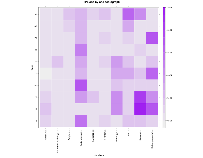
The columns are the hundreds, from 0-hundred to 9-hundred, and the rows are the tens, from 00–09 at the bottom up to 90–99 at the top. So the bottom left hand corner is 000–009, the square above that is 010–019, and so on up to the top square on the left, which is 090–099. Over on the right, the bottom square is 900–909 and the top square is 990–999. The intensity of the colour in the square represents the depth of the holdings in that range of call numbers: darker squares have more holdings. (For more about all this, please see the article.)
I liked looking at these, and I began to think, what if they were bigger? Maybe I could generate a huge 300 dpi image and take it to a print shop and get a poster printed. Then I could hang it on my wall. That would look nice. But then I thought, wait a minute, I could paint it. I could paint it big.
I bought a 48” × 48” canvas and a few rolls of green artist’s tape and set to work turning the visualization into a painting. I spent a while at first making different tints of the purple I was using to see if I could find a process that would let me get the colours as close as possible to the R visualization, or at least to where on a scale from 0 to 10 I would be able to use the same 3 for two different squares even if was painting them at different times.
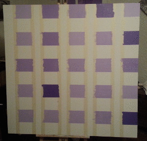
After some testing I decided that instead of making some finicky process I’d just do it by eye. I mixed and tinted batches as I needed them, over the five days I was working on it. It’s not completely accurate, but that makes it more interesting.
This animated image shows some photos I took while I was painting. I taped five columns onto the canvas and did one step of half the rows and then another step with the other half, then repeated that for the other five columns, so there were four stages to the painting.
The finished painting, TPL Dentograph 1 (2013)
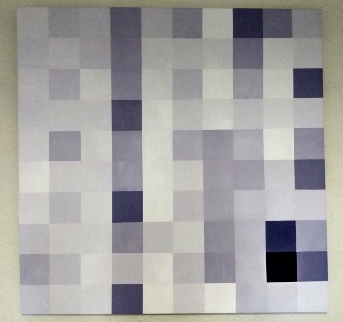
Later I began to be aware of something that I’d had probably seen for years but not observed: lots of twentieth-century artists painted squares. For example as Dutch artist Piet Mondrian was moving from representational work (such as trees) into the pure colour squares and rectangles like Broadway Boogie Woogie (1943), he painted some colourful checkerboards. Ellsworth Kelly did the same with some of his hard-edge works.
Their intentions and processes were different from mine, but I see all these works as being connected. They’re all made up of coloured squares. Mine began as a visualization of a library collection, but if the viewer doesn’t know this, it just seems like a colourful checkerboard.
STAPLR
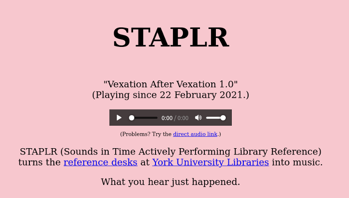
STAPLR is a sonification of activity at all the help, circ and research desks, in person or online, at York University Libraries. It’s meant to be played in the background to give you an ambient awareness of how busy things are at the desks.
What is a sonification? Where a visualization turns data into something visual, a sonification turns it into sound or music. The oldest, most familiar example might be a Geiger counter, where the more radioactivity it detects the more it clicks. That’s a very simple but very effective mapping of data to sound.
STAPLR stands for Sounds in Time Actively Performing Library Reference. I called it that for two reasons. First, at the start it only used data about reference desk activity, though later we expanded the data collection to all service points, and now I include everything. Second, nothing in library school prepared me for how important staplers are. When I started on a reference desk I was amazed at how much time I spent refilling and unjamming them, and I wanted to honour that.
At my library we track all activity at desks with a program called LibStats, which is free and open source but so old I think it’s dropped off the web. It looks like this.
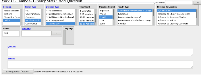
For each encounter, we record six types of categorical data, plus a timestamp, and, for reference help, the question and possibly an answer:
- Location
- Patron Type
- Question Type (1 = directional, …, 5 = specialized subject knowledge)
- Time Spent
- Question Format (in person, email, etc.)
- Faculty
This is the data at hand. When sonifying it, I need to map it to properties of sound (e.g. pitch, timbre and duration) and then make the sound.
To make the sound, I use Sonic Pi, which is a software synthesizer. It isn’t a physical thing you buy, with piano keys and buttons, you control it by writing code in a special simple programming language. Sonic Pi is a fantastic tool, and I highly recommend checking it out if you don’t know it. Look for videos about “live coding” on YouTube. It’s also a great tool for learning how to program, because when you make music with it you get instant feedback from the music, and it’s very error-resistant, so if you make a mistake the program doesn’t crash.
I’ve had several compositions running on STAPLR over the years. For a long time I ran “Drone Swell Chord” with these mappings:
- Location: timbre (synthesizer sound)
- Question Type: pitch (chosen from a C major chord)
- Time Spent: duration
Every minute, STAPLR asks LibStats what just happened and LibStats gives back a CSV file with the data. If someone just added a question at the science library, of type 3 (“skill-based: non-technical”), which took ten minutes, then STAPLR would choose one of a small defined set of pitches, and play it for ten minutes on the synthesizer representing the science library. If more than one thing was happening, more than one sound would be made, and they built up into a big static drone.
Here is a ten minute sample from March 2018:
All of this makes a very nice ambient way of being aware of what’s going on at the desks: if it’s quiet on STAPLR, it’s quiet out there. If it’s busy on STAPLR, it’s busy out there.
I’ve played around with some different mappings of data to sound, but more recently I’ve started ignoring everything except duration. Right now I’m running “Vexation After Vexation,” which is an adaptation of the piano work Vexations by the French composer Erik Satie.
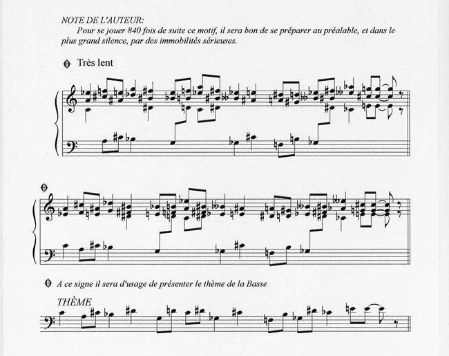
Vexations is very short piece that takes 60 or 90 seconds to play and is meant to be played, it seems, 840 times in a row. This could take around eighteen hours.
“Vexation After Vexation” uses a tempo where one iteration takes exactly one minute to play. For every minute of every interaction at any desk, one iteration plays on a synthesized piano. It uses a counter that gets added to every time a new desk interaction is recorded, and subtracted from each minute an iteration plays. It ends up that this same piece repeats over and over and over, for as many minutes, in total, as there were total minutes of interaction at the desks. When classes were in session and things were busier STAPLR might play for hours at a time before going quiet. Now it’s less busy, but when it happens, the repetition of the piece, over and over, at a low volume, is quite lovely to hear.
Here is a ten minute sample from April:
You can listen to the live audio stream here:
The code is under the GPL and available on GitHub: https://github.com/wdenton/staplr.
Three things to try
I’ll close with three approaches that I have found work for me and may be useful for other people who want to turn data into art, or, more generally, use anything from libraries and archives as part of their creative practice.
- Transform it.
- Work by hand.
- Abstract it.
Transform it: Get it out of the computer and R or Excel or however you’re making it, and shift it into another medium. That could be something physical (paper or canvas, collage, sculpture, fabric) or dance or music or film or theatre. Data that we usually see in two dimensions on a screen, existing without a duration in time, can move into three-dimensional space and take time to experience.
Work by hand: Again, this involves getting it out of the computer and working by hand with real objects, such as painting with a brush or sewing material together or playing guitar, or using not just your hands but your entire body. This will get your mind working in fresh ways and lead to new insights and ideas.
Abstract it: Don’t get bogged down with details, and don’t worry about doing a completely accurate representation of what you have. Fuzz it out, blur it, leave out pieces, introduce some noise, or extract one part of the data and start with that in a fresh context.
The two examples I talked about don’t do all three at the same time! They each do two, but that’s good enough.
Conclusion
Thanks again to LACUNY for giving me this time, and to all of you for listening. If any of you are making art out of libraries and archives, then congratulations! The examples I’ve seen yesterday and today are wonderful and I hope to see more. I encourage everyone to try, and I hope that all of us that are doing this kind of thing can keep in touch somehow. Thank you.