I just finished reading Robert Bringhurst’s fantastic The Elements of Typographic Style. It’s full of good advice, informed by a thorough knowledge of all aspects of type and book design, and as an object the book itself is gorgeous. I got it from the library but midway through I emailed Book City to ask them to get me a copy, because I want my own. This will be a regular reference.
Bringhurst has advice about text figures, which were new to me—or seemed so, but then I realized I’d seen them many times but never observed them. They’re lowercase numbers! They have ascenders and descenders, unlike “titling figures,” which are all the same height as capital letters. Unless you’ve gone to a great deal of trouble with your browser then I bet you’re seeing titling figures right now on this page.
Looking at back at where I thought I remembered seeing text figures, I had memories of British books. Here’s a scan of the inside page of my 1967 Fontana (I bet 1967 and F are the same height) paperback edition of Anthony Powell’s A Buyer’s Market:
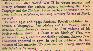
Those numbers look great and fit in beautifully with the text, which makes it all flow well.
I decided I wanted to use text figures in what I write, including at work, where when I do something myself I write it in Org and then export to LaTeX and convert to PDF. (If I write a shared document we usually use Google Docs. All I bother with there is making sure headings are styled as headings, not formatted as large bold plain text.) Looking around I saw that Baskvervaldx has text figures, and it’s a version of Baskerville, which I’ve always liked in books, partly because of the Sherlock Holmes connection.
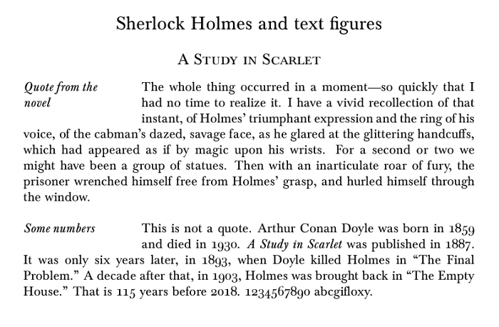
I tweaked my LaTeX defaults, and now my PDFs can look like this (the larger version has more detail):
They won’t all have those dropped headings, but some will. I got inspired by Bringhurst’s book and started using titlesec to format my titles. This is the code to make things look like that example:
\usepackage[osf]{Baskervaldx}
\usepackage{titlesec}
\titleformat{\section} {\centering\Large}{\thesection}{}{}
\titleformat{\subsection} {\centering\large\scshape}{\thesection}{}{}
\titleformat{\subsubsection}[drop]{\itshape}{\thesection}{}{}{}
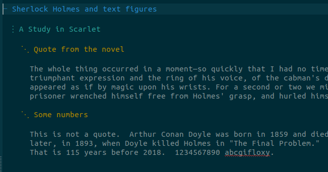
\titlespacing{\subsubsection}{0.75in}{\baselineskip}{0.5in}For comparison, this is what the example text looks like in Emacs while I’m writing it, before Org works its magic:
Some people really care about typefaces, but I don’t (though perhaps that will change). Bringhurst goes into a lot of detail about them, more than I need, and I did skim a bit. I’m interested up to a certain point, but then they just end up looking the same to me and the nuances are lost. On the other hand, book design is something I do care about, and I learned a lot from Bringhurst. The Elements of Typographic Style is a treasure.
1234567890 looks shouty now, doesn’t it?