I’ve collected most of the number from the York University Libraries annual reports into one CSV file covering 2001–2013 (those are academic years, so 2013 is 2012–2013). I just realized how to do nice year-to-base comparisons to see how things have been growing and changing since 2001, and to make it easier for myself later, I’ll post it all here.
First thing, load up two R packages we’ll need, then read in the CSV file. It’s nice how R can read in a file on the web without doing anything special. Second, glom together the archives, maps and film/audio libraries into “Scott,” which is the name of the biggest library at York. They are all small branches inside Scott. The comparisons are easier when its four branches, not seven. (The law library on campus is a separate unit and its numbers aren’t part of our reports.)
> library(dplyr)
> library(ggplot2)
> yul <- read.csv("http://www.miskatonic.org/files/yul-annual-statistics-2001-2013.csv")
> str(yul)
'data.frame':	91 obs. of  8 variables:
 $ Year                   : int  2001 2001 2001 2001 2001 2001 2001 2002 2002 2002 ...
 $ Branch                 : chr  "Scott" "Scott" "Scott" "Scott" ...
 $ Users                  : int  27643 NA NA NA 4491 1737 3458 28032 NA NA ...
 $ TurnstileCount         : int  NA NA NA NA NA NA NA NA NA NA ...
 $ ItemsShelved           : int  NA NA NA NA NA NA NA NA NA NA ...
 $ Reference              : int  87423 4455 3969 1429 13178 6040 8789 99233 6826 6126 ...
 $ InstructionClasses     : int  375 NA NA NA 62 40 30 396 NA NA ...
 $ InstructionParticipants: int  8447 NA NA NA 1286 799 91 10156 NA NA ...
> yul$Branch[yul$Branch == "Archives"] <- "Scott"
> yul$Branch[yul$Branch == "Maps"] <- "Scott"
> yul$Branch[yul$Branch == "SMIL"] <- "Scott"
> yul.reference <- yul %.% select (Year, Branch, Users, Reference) %.%
  group_by(Year, Branch) %.%
  summarise(users = sum(Users, na.rm=TRUE), questions = sum(Reference, na.rm=TRUE))
> head(yul.reference)
Source: local data frame [6 x 4]
Groups: Year

  Year   Branch users questions
1 2001 Bronfman  4491     13178
2 2001    Frost  1737      6040
3 2001    Scott 27643     97276
4 2001  Steacie  3458      8789
5 2002 Bronfman  4871     12038
6 2002    Frost  1748      7813
The above shows how the small branches were renamed, and then, using dplyr, the numbers I want are picked out and put into a nice small data frame. The number of questions asked at the branches that were put together into Scott are summed into one number.
A note about the users column:
I want to calculate how things have changed since 2001, so I want to make ratios for all later years by dividing their numbers by those from 2001. (This assumes 2001 is an average year—I don’t know if it is, but it’s 12 years ago, which is about one-quarter of York’s existence, so it seems long enough, and besides, that’s as far back as I could easily get the numbers.)
Make a data frame holding just the 2001 numbers:
> base <- yul.reference %.% filter(Year == 2001) %.%
  select(Year, Branch, base.users = users, base.questions = questions)
> base
Source: local data frame [4 x 4]
Groups: Year

  Year   Branch base.users base.questions
1 2001 Bronfman       4491          13178
2 2001    Frost       1737           6040
3 2001    Scott      27643          97276
4 2001  Steacie       3458           8789
Then merge that with the yul.reference data frame. R duplicates everything as necessary.
> ratios <- merge(yul.reference, base, by = "Branch")
> head(ratios)
    Branch Year.x users questions Year.y base.users base.questions
1 Bronfman   2006  6876     13635   2001       4491          13178
2 Bronfman   2001  4491     13178   2001       4491          13178
3 Bronfman   2009  5823     12194   2001       4491          13178
4 Bronfman   2004  5900      6174   2001       4491          13178
5 Bronfman   2012  6050     21457   2001       4491          13178
6 Bronfman   2007  6622     16375   2001       4491          13178
> tail(ratios)
    Branch Year.x users questions Year.y base.users base.questions
47 Steacie   2002  3639     11540   2001       3458           8789
48 Steacie   2012 10018      9419   2001       3458           8789
49 Steacie   2009  8529     13466   2001       3458           8789
50 Steacie   2006  5307     16282   2001       3458           8789
51 Steacie   2003  3845     12510   2001       3458           8789
52 Steacie   2013 10394      7565   2001       3458           8789
The rows got jumbled up, but that doesn’t matter. Notice how the right base.users and base.questions numbers were repeated for every branch’s row in yearly.reference.
Now all the numbers are in the right places, and it’s just a matter of dividing this by that and that by the other to find all the ratios I want. (If you want to compare one year to the previous one, lag is the way to go, as Calculate groupwise ratio of consecutive values in R at Stack Overflow explains).
> ratios <- mutate(ratios, users.ratio = users / base.users,
    questions.ratio = questions / base.questions,
    questions.per.user = questions / users)
> head(ratios)
    Branch Year.x users questions Year.y base.users base.questions users.ratio questions.ratio questions.per.user
1 Bronfman   2001  4491     13178   2001       4491          13178    1.000000       1.0000000          2.9343131
2 Bronfman   2011  5991     19773   2001       4491          13178    1.334001       1.5004553          3.3004507
3 Bronfman   2008  6264      6174   2001       4491          13178    1.394790       0.4685081          0.9856322
4 Bronfman   2005  6637     12641   2001       4491          13178    1.477845       0.9592503          1.9046256
5 Bronfman   2002  4871     12038   2001       4491          13178    1.084614       0.9134922          2.4713611
6 Bronfman   2012  6050     21457   2001       4491          13178    1.347139       1.6282440          3.5466116
First, we can see how the number of home users has been growing at the branches:
> ggplot(ratios, aes(x = Year.x, y = users/1000, group = Branch)) +
  geom_line(aes(colour=Branch), size = 2) +
  scale_colour_brewer(palette="Spectral", name="") +
  theme(legend.text = element_text(size = 12), legend.key.size = unit(1, "cm")) +
  labs(x = "", y = "000s", title = "Home users at YUL branches")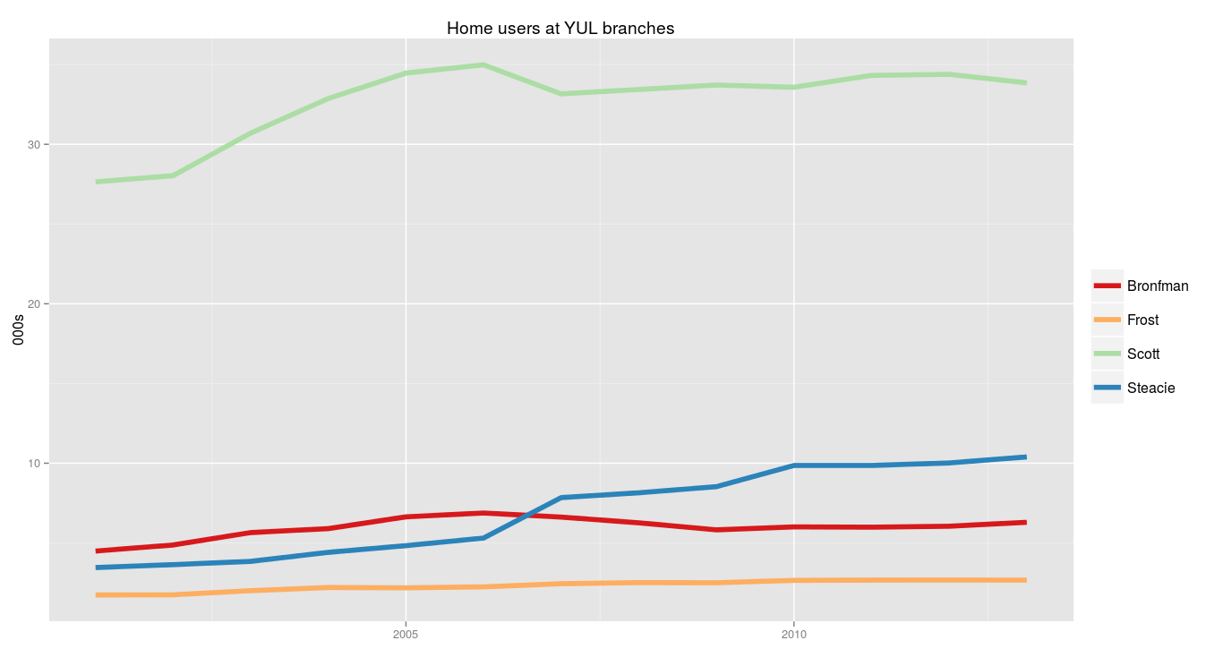
Next, percentage growth compared to 2001. The science program at York used to be surprisingly small, but it’s been growing the last few years, and will continue to grow, and this shows it:
> ggplot(ratios, aes(x = Year.x, y = 100*users.ratio, group = Branch)) +
  geom_line(aes(colour = Branch), size = 2) +
  scale_colour_brewer(palette = "Spectral", name = "") +
  theme(legend.text = element_text(size = 12), legend.key.size = unit(1, "cm")) +
  labs(x = "", y = "%", title = "Change in YUL home users (to 2001 base)")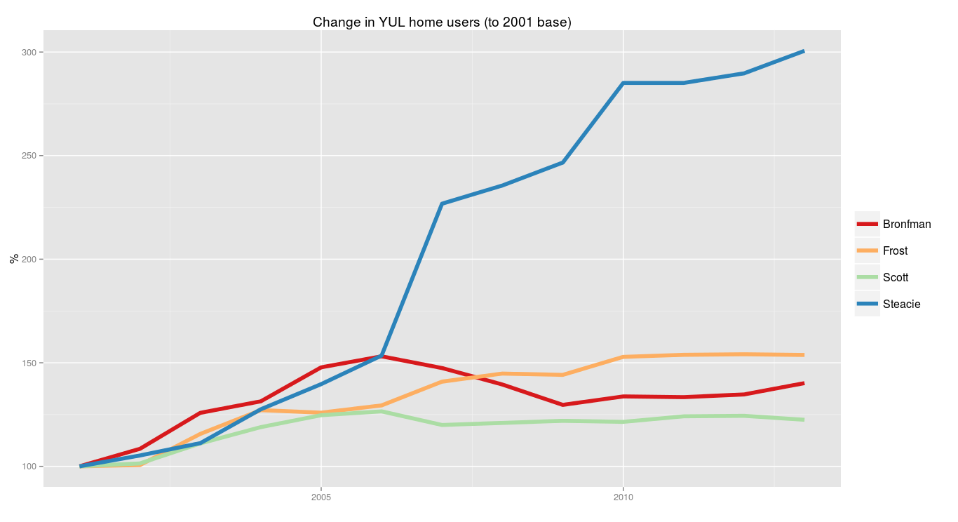
Next, total number of questions asked each year. It’s going down.
> ggplot(ratios, aes(x = Year.x, y = questions/1000, group = Branch)) +
  geom_line(aes(colour = Branch), size = 2) +
  scale_colour_brewer(palette = "Spectral", name = "") +
  theme(legend.text = element_text(size = 12), legend.key.size = unit(1, "cm")) +
  labs(x = "", y = "000s", title = "Number of questions")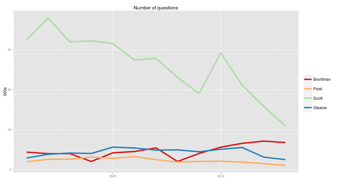
The dip in 2009 is explained by the lengthy strike that stopped classes for three months. Without the strike, I imagine the line from 2008–2010 might have been fairly straight, or perhaps 2010 would have been a little lower so the decline would actually be seen starting in 2007. That’s just a guess.
(There’s no way from these aggregate numbers to tell what types of questions are being asked less, or where, but the LibStats tracking we do shows that it’s almost entirely directional and tech support questions.)
Finally, looking at the number of questions per home user at each branch shows something striking:
> ggplot(ratios, aes(x = Year.x, y = questions.per.user, group = Branch)) +
  geom_line(aes(colour = Branch), size = 2) +
  scale_colour_brewer(palette = "Spectral", name = "") +
  theme(legend.text = element_text(size = 12), legend.key.size = unit(1, "cm")) +
  labs(x = "", y = "", title = "Questions per home user")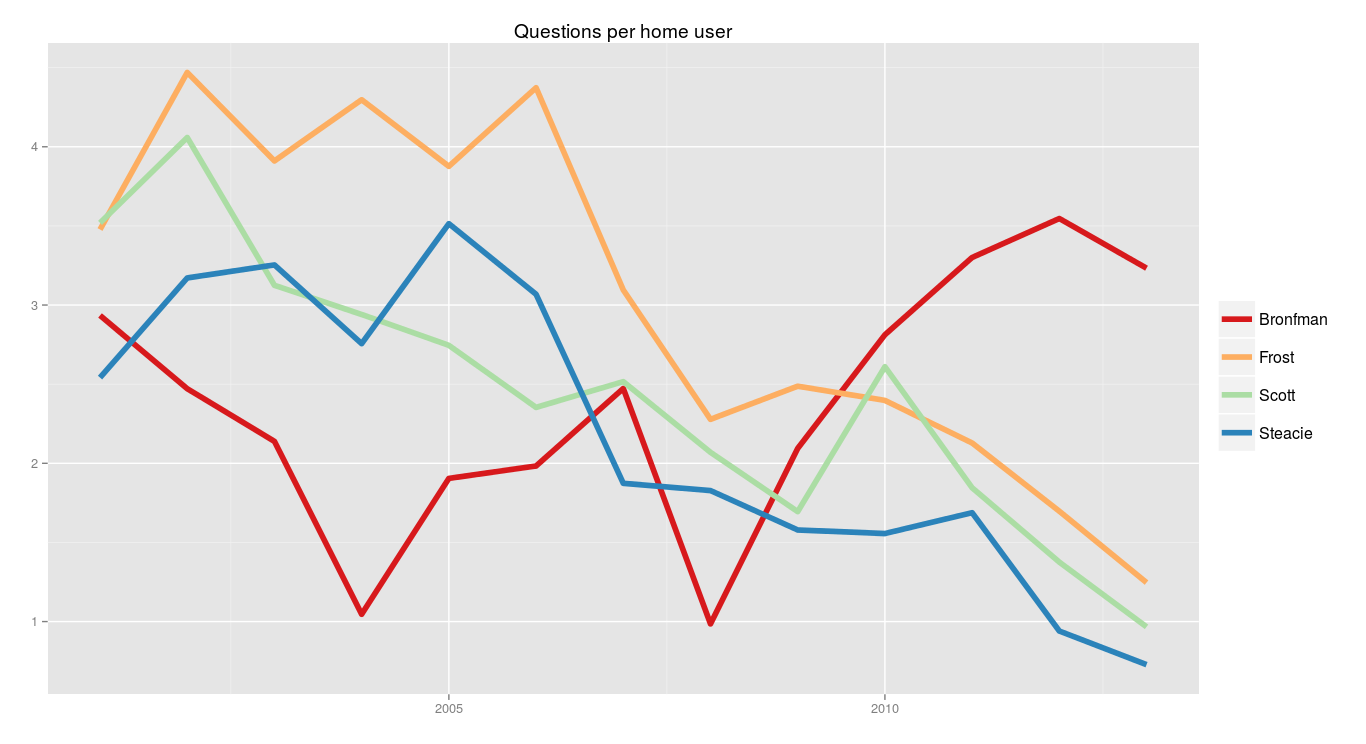
I don’t know why there’s a dip in 2008, but you can see how clearly the Bronfman numbers went up over the last five years (until the slight decline last year) while the other branches are falling. If 2008 is anomalous and set aside, Bronfman has increased for quite a few years while the others decline.