After my last post about #c4l13 tweets I got a couple of tweets from Hadley Wickham pointing me at the R package seriation: it "will make it much easier to see clusters," he said. If Hadley Wickham recommended it I had to check it out.
I installed it in R:
> install.packages("seriation")
Then I read the documentation. Like a lot of R documentation for it looks rather forbidding and cryptic at the start (to me, at least), but all R documentation includes examples, and once you find the right thing to copy and paste and then fiddle with, you're on your way.
The seriate function is explained thusly: "Tries to find an linear order for objects using data in form of a dissimilarity matrix (two-way one mode data), a data matrix (two-way two-mode data) or a data array (k-way k-mode data)." Hadley mentioned clusters ... this says dissimilarity ... hmm.
I tried the example code, which uses the iris data set that's built into R.
> data("iris")
> x <- as.matrix(iris[-5])
> x <- x[sample(1:nrow(x)),]
> d <- dist(x)
> order <- seriate(d)
> order
object of class ‘ser_permutation’, ‘list’
contains permutation vectors for 1-mode data

  vector length seriation method
1           150             ARSA
> def.par <- par(no.readonly = TRUE)
> layout(cbind(1,2), respect = TRUE)
> pimage(d, main = "Random")
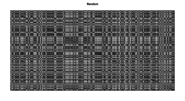
> pimage(d, order, main = "Reordered")
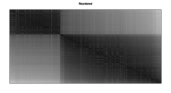
Aha! Something interesting is going on there.
One of the other parts of the documentation is a Townships data set: "This data set was used to illustrate that the conciseness of presentation can be improved by seriating the rows and columns." Let's try the example code, just copying and pasting:
> data(Townships)
> pimage(Townships)
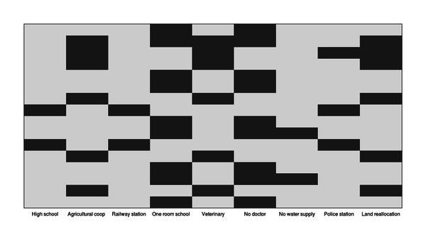
Ho hum.
> order <- seriate(Townships, method = "BEA", control = list(rep = 5))
> pimage(Townships, order)
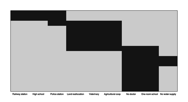
Hot diggity! If I could use this package to improve the stuff I did last time, fantastic.
I'm going to skip over two or three hours of fiddling with things and not understanding what was going on. Crucial to all of what comes next, especially in getting it to work with the ggplot2 package, is this gist of an example of seriation, which I found in a Google search. As often happens my first attempt to get things working failed, so I created a very minimal example and went through the steps many times until it worked. I'm not sure what the problem was any more---probably something to do with not referring to a column of data properly---but once it worked, it was easy to apply the steps to the full data set.
That full data set is online, so you can copy and paste what follows and it should work. If you haven't installed the ggplot2, plyr and reshape2 packages (all created by Hadley Wickham, apparently an inexhaustible superhuman repository of Rness), you'll need to. Skip the first three lines if you have, but either way you'll need to load them in.
> install.packages("ggplot2")
> install.packages("plyr")
> install.packages("reshape2")
> library(ggplot2)
> library(plyr)
> library(reshape2)
> mentions.csv <- read.csv("http://www.miskatonic.org/files/20130223-tweets-mentioned.csv")
> head(mentions.csv)
        tweeter       mentioned
1   anarchivist mariatsciarrino
2   anarchivist        eosadler
3 tararobertson         ronallo
4     saverkamp        benwbrum
5     saverkamp mathieu_boteler
6     saverkamp          kayiwa
> mentions <- count(m, c("tweeter", "mentioned"))
> head(mentions)
         tweeter     mentioned freq
1     3windmills         yo_bj    1
2    aaroncollie        kayiwa    1
3 aaronisbrewing tararobertson    1
4     abedejesus tararobertson    1
5       abugseye  bretdavidson    1
6       abugseye     cazzerson    1
> nrow(mentions)
[1] 2201
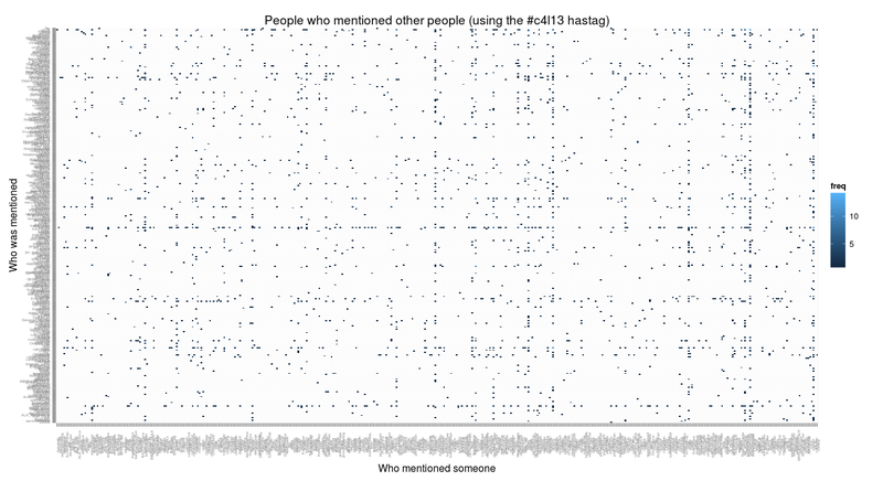
This mentions data frame is what we'll be working with. It's 2,201 lines long and tells how many times anyone using the #c4l13 hashtag mentioned anyone else.
> ggplot(count(mentions, c("tweeter", "mentioned")), aes(x=tweeter, y=mentioned))
+ geom_tile(aes(fill=freq))
+ theme(axis.text = element_text(size=4), axis.text.x = element_text(angle=90))
+ xlab("Who mentioned someone") + ylab("Who was mentioned")
+ labs(title="People who mentioned other people (using the #c4l13 hastag)")
All right, folks. Let's seriate.
> mentions.cast <- acast(mentions, tweeter ~ mentioned, fill = 0)
Using freq as value column: use value.var to override.
> mentions.seriation <- seriate(mentions.cast, method="BEA_TSP")
> mentions$tweeter <- factor(mentions$tweeter, levels = names(unlist(mentions.seriation[[1]][])))
> mentions$mentioned <- factor(mentions$mentioned, levels = names(unlist(mentions.seriation[[2]][])))
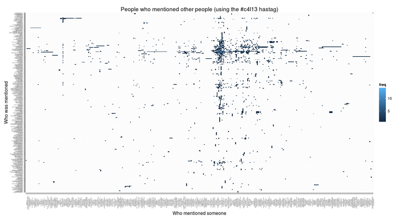
> ggplot(count(mentions, c("tweeter", "mentioned")), aes(x=tweeter, y=mentioned))
+ geom_tile(aes(fill=freq))
+ theme(axis.text = element_text(size=4), axis.text.x = element_text(angle=90))
+ xlab("Who mentioned someone") + ylab("Who was mentioned")
+ labs(title="People who mentioned other people (using the #c4l13 hastag)")
WHOA!
The acast command turns the three-column mentions data frame into a 433x339 matrix, with tweeter names as rows and mentioned names as columns. The value of the matrix at each cell is how many times the mentioned person was mentioned by the tweeter. We know what 3windmills mentioned yo_bj once, so there's a 1 at that spot in the matrix. We need this matrix to feed into the seriate command, which creates a special object:
> mentions.seriation
object of class ‘ser_permutation’, ‘list’
contains permutation vectors for 2-mode data

  vector length seriation method
1           433          BEA_TSP
2           339          BEA_TSP
We can poke into it a bit by working through the commands used above:
> head(mentions.seriation[[1]][])
       jaleh_f  NowWithMoreMe  WNYLIBRARYGUY andrewinthelib         p3wp3w
           186            301            422             23            306
     Hypsibius
           175
> head(unlist(mentions.seriation[[1]][]))
       jaleh_f  NowWithMoreMe  WNYLIBRARYGUY andrewinthelib         p3wp3w
           186            301            422             23            306
     Hypsibius
           175
> head(names(unlist(mentions.seriation[[1]][])))
[1] "jaleh_f"        "NowWithMoreMe"  "WNYLIBRARYGUY"  "andrewinthelib"
[5] "p3wp3w"         "Hypsibius"
This is a list of names ordered in a way that seriate has determined will make an optimal ordering. We force our data frame to use this ordering, and then we get the nicer chart.
All right, that's pretty fine, but that's a lot of people and a lot of stuff going on. What if we dig into it a bit and simply things? What if we pick a user and analyze the nexus of tweeting action around them? Let's start with a boring example: me.
> wdenton.tweets <- subset(mentions, (tweeter == "wdenton" | mentioned == "wdenton"))
> wdenton.nexus <- subset(mentions, tweeter %in% unique(c(as.vector(wdenton.tweets$tweeter), as.vector(wdenton.tweets$mentioned))))
> wdenton.cast <- acast(wdenton.nexus, tweeter ~ mentioned, fill = 0)
Using freq as value column: use value.var to override.
> wdenton.seriation <- seriate(wdenton.cast, method="BEA_TSP")
> wdenton.nexus$tweeter <- factor(wdenton.nexus$tweeter, levels = names(unlist(wdenton.seriation[[1]][])))
> wdenton.nexus$mentioned <- factor(wdenton.nexus$mentioned, levels = names(unlist(wdenton.seriation[[2]][])))
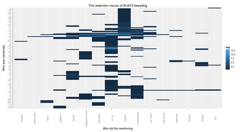
> ggplot(wdenton.nexus, aes(x=tweeter, y=mentioned))
+ geom_tile(aes(fill=freq))
+ theme(axis.text.y = element_text(size=3), axis.text.x = element_text(size=10, angle=90))
+ xlab("Who did the mentioning") + ylab("Who was mentioned")
+ labs(title="The wdenton nexus of #c4l13 tweeting")
Blowing my mind!
What's going on here? First we pick out every instance where I either mention someone or someone mentions me.
> head(wdenton.tweets)
        tweeter mentioned freq
131         arg   wdenton    1
312   calvinmah   wdenton    1
812    ian_chan   wdenton    1
1099 lljohnston   wdenton    1
1466 nelltaylor   wdenton    1
1469   nihiliad   wdenton    1
Then we expanded that to a tweet nexus (this is like superduping) by saying: for every person that I mentioned or mentioned me, find everyone who mentioned them or they mentioned.
> head(wdenton.nexus)
      tweeter    mentioned freq
128       arg      sabarya    1
129       arg     save4use    1
130       arg       tmasao    1
131       arg      wdenton    1
310 calvinmah       kayiwa    2
311 calvinmah PuckNorris19    1
Then we just did the same as we'd done before to seriate it and make a chart.
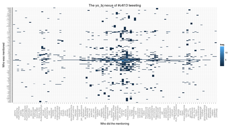
There's something shared between this chart and the big one, and I call it the kayiwa-yo_bj vortex. yo_bj mentioned a lot of people (because Becky Yoose is a lively tweeter), and kayiwa was mentioned by a lot of people (because Francis Kayiwa was the chief conference organizer) and Becky mentioned Francis, so a common set of people emerges.
Let's see what happens if we look at yo_bj herself.
> yobj.tweets <- subset(mentions, (tweeter == "yo_bj" | mentioned == "yo_bj"))
> yobj.nexus <- subset(mentions, tweeter %in% unique(c(as.vector(yobj.tweets$tweeter), as.vector(yobj.tweets$mentioned))))
> yobj.cast <- acast(yobj.nexus, tweeter ~ mentioned, fill = 0)
Using freq as value column: use value.var to override.
> yobj.seriation <- seriate(yobj.cast, method="BEA_TSP")
> yobj.nexus$tweeter <- factor(yobj.nexus$tweeter, levels = names(unlist(yobj.seriation[[1]][])))
> yobj.nexus$mentioned <- factor(yobj.nexus$mentioned, levels = names(unlist(yobj.seriation[[2]][])))
> ggplot(yobj.nexus, aes(x=tweeter, y=mentioned))
+ geom_tile(aes(fill=freq))
+ theme(axis.text.y = element_text(size=3), axis.text.x = element_text(size=10, angle=90))
+ xlab("Who did the mentioning") + ylab("Who was mentioned") + labs(title="The yo_bj nexus of #c4l13 tweeting")
Fewer people who did the mentioning, but a lot of people getting mentioned, and roughly the same kind of shape as we saw before.
I did this a few more times on different people, then I realized that I was just repeating myself: I was running the same commands over and over, just starting with a different username. When that happens, you need to automate things. So I made a function.
> chart.nexus <- function (username) {
  username <- tolower(username)
  tweets <- subset(mentions, (tweeter == username | mentioned == username))
  tweets.nexus <- subset(mentions, tweeter %in% unique(c(as.vector(tweets$tweeter), as.vector(tweets$mentioned))))
  tweets.cast <- acast(tweets.nexus, tweeter ~ mentioned, fill = 0)
  tweets.seriation <- seriate(tweets.cast, method="BEA_TSP")
  tweets.nexus$tweeter <- factor(tweets.nexus$tweeter, levels = names(unlist(tweets.seriation[[1]][])))
  tweets.nexus$mentioned <- factor(tweets.nexus$mentioned, levels = names(unlist(tweets.seriation[[2]][])))
  ggplot(tweets.nexus, aes(x=tweeter, y=mentioned)) + geom_tile(aes(fill=freq)) + theme(axis.text.y = element_text(size=3), axis.text.x = element_text(size=10, angle=90)) + xlab("Who did the mentioning") + ylab("Who was mentioned") + labs(title=paste("The", username, "nexus of #c4l13 tweeting"))
}
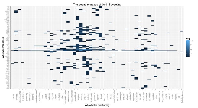
> chart.nexus("eosadler")
That's the tweet nexus around Bess Sadler, whose talk Creating a Commons was a highlight of conference. (More about that and a couple of other talks soon, I hope.) You can see the kayiwa-yo_bj vortex.
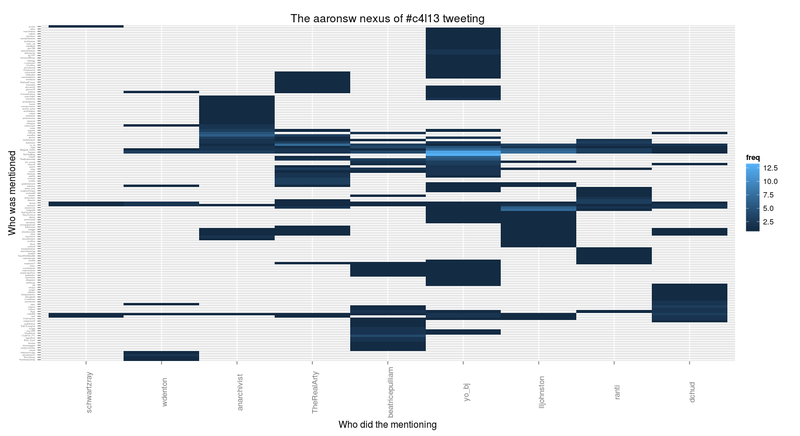
Aaron Swartz was missed by us all. You can see the vortex around him, too.
> chart.nexus("aaronsw")
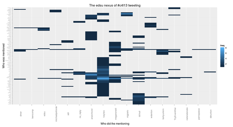
Ed Summers wasn't there, but he was watching the video stream and chatting in IRC and on Twitter:
> chart.nexus("edsu")
yo_bj doesn't show there in the mentioners on the x-axis, which surprised me. The kayiwa part of the vortex is evident, though.
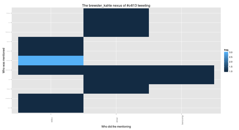
Brewster Kahle was mentioned a few times in discussions relating to the Open Library. No vortex here, but you can see edsu tweeting at him a few times.
> chart.nexus("brewster_kahle")
Having done all this, two things strike me: first that I should try Shiny for this, and second that some sort of graph would probably be a better representation of the connections between people. Still, I learned a lot, the charts are cool, and I coined the ridiculous phrase "the kayiwa-yo_bj vortex."
 Miskatonic University Press