I got curious about what else I might pull out of that set of tweets I had with a bit of basic R hacking, just for fun, while I’m on a train watching the glories of autumnal Ontario pass by.
What does the data frame look like? These are the column names:
> colnames(y)
 [1] "text"         "favorited"    "replyToSN"    "created"      "truncated"
 [6] "replyToSID"   "id"           "replyToUID"   "statusSource" "screenName"
The rows are too wide to show, but it's easy to pick out the screenName values, which are the Twitter usernames:
> head(y$screenName)
[1] djfiander    MarkMcDayter shlew        jordanheit   ENOUSERID
[6] AccessLibCon
197 Levels: mjgiarlo anarchivist adr elibtronic weelibrarian ... MarkMcDayter
197 different usernames among the 1500 tweets. Who tweeted the most? Is there some kind of power law going on, where a few people tweeted a lot and a lot of people tweeted very little?
> tweeters.count <- count(y, "screenName")
> head(tweeters.count)
    screenName freq
1     mjgiarlo    3
2  anarchivist    2
3          adr   88
4   elibtronic   11
5 weelibrarian   53
6  TheRealArty   57
> ggplot(tweeters.count) + aes(x = screenName, y = freq) + geom_bar(stat="identity")
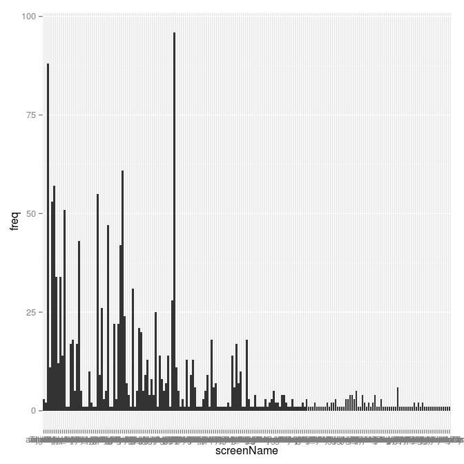
That's not very nice: it's not sorting by number of tweets. I send this chart back to the nether regions whence it sprang!
The chart looks that way because the bars in ggplot2 are ordered by the ordering of the levels in the factor.
> head(factor(tweeters.count$screenName))
[1] mjgiarlo     anarchivist  adr          elibtronic   weelibrarian
[6] TheRealArty
197 Levels: mjgiarlo anarchivist adr elibtronic weelibrarian ... MarkMcDayter
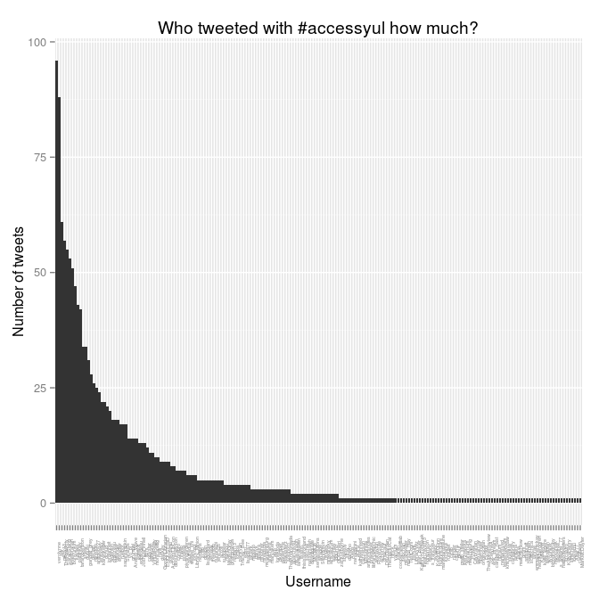
We want to get things sorted by freq. This confusing line will do it:
> tweeters.count$screenName <- factor(tweeters.count$screenName, levels = arrange(tweeters.count, desc(freq))$screenName)
This rearranges the ordering of the rows in the tweeters.count data frame according to the ordering in that arrange statement at the end. Here's what it does, using head to show only the first few lines:
> head(arrange(tweeters.count, desc(freq)))
    screenName freq
1    verolynne   96
2          adr   88
3       mkny13   61
4  TheRealArty   57
5   SarahStang   55
6 weelibrarian   53
That's the ordering we want. So, with tweeters.count sorted properly, we can make the chart again, and this time pretty it up:
> ggplot(tweeters.count) + aes(x = screenName, y = freq) + geom_bar(stat="identity") +
  theme(axis.text.x = element_text(angle = 90, size = 4)) +
  ylab("Number of tweets") +
  xlab("Username") +
  labs(title="Who tweeted with #accessyul how much?")
I also wondered: how were these aggregated by time? When were the most tweets happening? The created column holds the clue to that minor mystery.
> head(y$created)
[1] "2012-10-21 10:37:59 EDT" "2012-10-21 10:36:44 EDT"
[3] "2012-10-21 10:36:40 EDT" "2012-10-21 10:36:38 EDT"
[5] "2012-10-21 10:34:55 EDT" "2012-10-21 10:34:49 EDT"
Those timestamps are to the minute. Let's collapse them down to the hour, aggregate them, and plot them:
> y$tohour <-  format(y$created, "%Y-%m-%d %H")
> head(count(y, "tohour"))
         tohour freq
1 2012-10-18 09   12
2 2012-10-18 10   16
3 2012-10-18 11   15
4 2012-10-18 12    5
5 2012-10-18 13    7
6 2012-10-18 14    8
> ggplot(count(y, "tohour"), aes(x=tohour, y=freq)) + geom_bar(stat="identity") +
xlab("Hour") + ylab("Number of tweets") +
labs(title="#accessyul tweets by hours") +
theme(axis.text.x = element_text(angle = 90, size = 4))
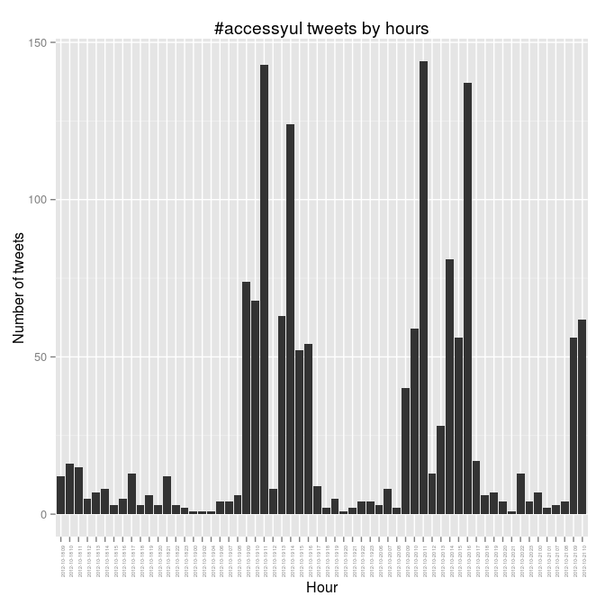
The busy days there are Friday and Saturday, and Friday goes nine-ten-ELEVEN and then nothing over the noon hour when we were at lunch. You can see the rest of the patterns. It would be interesting to correlate this to who was speaking, and to try to figure out what that means.