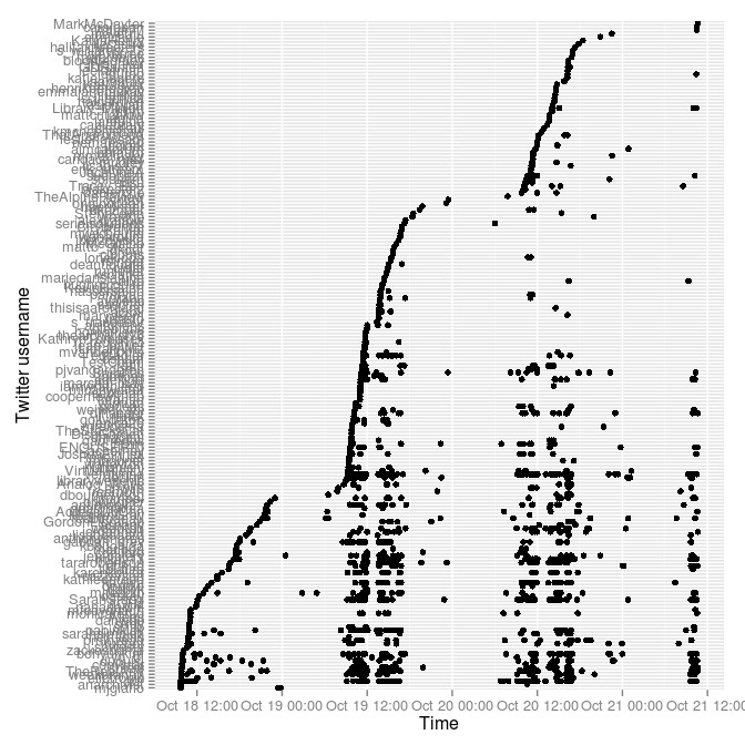
Following on from April's #thatcamp hashtags the Tony Hirst way, I went back to Tony Hirst's Visualising activity around a Twitter hashtag or search term using R to see what the #accessyul tweets (for the 2012 Access) looked like. This runs in R.
> require("twitteR")
> require("plyr")
> require("ggplot2")
> yultweets <- searchTwitter("#accessyul", n=1500)
> y <- twListToDF(yultweets)
> y$created <- as.POSIXct(format(y$created, tz="America/Montreal"))
> yply <- ddply(y, .var = "screenName", .fun = function(x) {return(subset(x, created %in% min(created), select = c(screenName,created)))})
> yplytime <- arrange(yply,-desc(created))
> y$screenName=factor(y$screenName, levels = yplytime$screenName)
> ggplot(y) + geom_point(aes(x=created,y=screenName)) + ylab("Twitter username") + xlab("Time")
> savePlot(filename="20121021-accessyul-tweets.png", type="png")
That pulls in the last 1500 #accessyul tweets (I grabbed it a couple of hours ago so it's now out of date), changes the time zone to show Montreal times, and graphs it with the great ggplot2 library. Time goes along the x axis, with a dot for every time a person (as listed on the y axis) tweets. The thick horizontal lines are heavy tweeters.

The tick labels on the y axis are too big, I know.
There are over 1500 tweets with this hash tag---if I'd thought of this before, I could have been grabbing and saving them this week so I could show all of them.
 Miskatonic University Press